")
Panic Stations Everyone
It is intriguing that the first reaction to any market move that does not reinforce the existing group recency bias is to panic. This is the somewhat breathless reaction from both the financial press and the interwebs to Friday’s slippage on Wall St. As a refresher, here are the closing figures for Friday’s session.
 Not the best day, but certainly not the worst. Much of the chatter has been about the why. I think a much better question is to ask what’s next. So armed with Excel and an afternoon to myself, I set about looking at previous falls of this magnitude and what happened next.
I used the S&P 500 back to 1957 and identified 197 occasions when the market fell by 2.6% or more. I then began to look at what happened in the 5-, 10-, and 20-trading days after the event.
The key finding is summarised in the snip below and can be described as simply a mild positive tendency, though with wide dispersion. In simple terms, the market goes up a bit, but the range of possible outcomes is large.
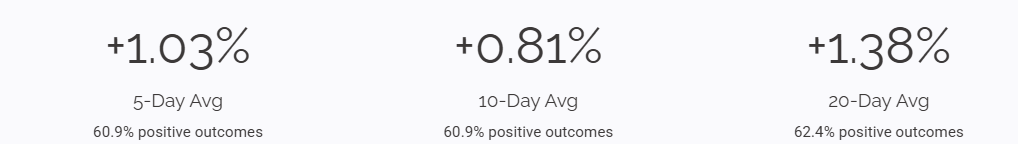
Large one-day falls have not, on average, led to further immediate collapse. Both average and median forward returns are positive across all time horizons. However, the dispersion is extreme. The average figure conceals that nasty reality that large down days occur in unstable markets and that both sharp rebounds and extreme liquidations are possible.
The Signal Day Is Not Usually The Low
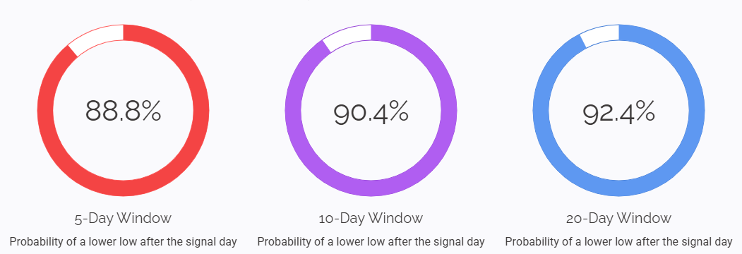
The most important finding is that the index made a lower low after the signal day.
The Sting Is In The Tail
Averages only tell us so much – they don’t tell us about the range of possible outcomes. This is why traders often get caught relying on averages. Back in the old days, when I used to do similar analysis in a different profession, the one tool that told us an awful lot was error bars.
These gave you an idea of the uncertainty, variability, or error associated with a given data point. They gave you a much better idea of the real-world possibilities, and in this instance, looking at the tails shows a profoundly asymmetric distribution.

What this means is that if you are making your bets based upon averages, there is a good chance you will get blown out of the water by one of these asymmetries.
Size Matters
As you would expect, the size of the fall on the signal day matters greatly. The chart below looks at the returns following falls of a given size. As you can see, the falls on Friday sit in a fairly benign position compared ot deeper falls.
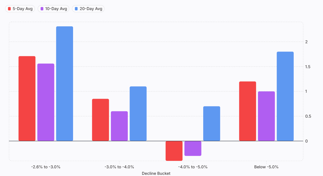
The weakest bucket was the -4.0% to -5.0% range, where the 5-day and 10-day average returns were negative, and the positive outcome rate fell below 50%. This suggests that the market’s response is not linear. A very large one-day fall may reflect panic selling.
Above Or Below The 200 Day Moving Average
The results here were a mixed bag.
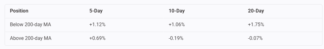
I had to think about this for a bit because the results seem to be counterintuitive. My thinking is that this is consistent with the behaviour of crisis markets. Large falls below the 200-day moving average often occur after substantial prior weakness, where forced selling and panic can create short-term rebound potential. There is always someone willing to buy any dip.
By contrast, a large fall while the index remains above the 200-day moving average may be more ambiguous. It can represent either an isolated shock within an uptrend or the first warning that the trend structure is beginning to deteriorate.
The latest event occurred with the index still approximately 7.7% above its 200-day moving average. Historically, that condition has produced weaker forward average returns than the below-200-day group.
Distance From All Time High
Drawdown always matters, and the backdrop to the drawdown matters even more.
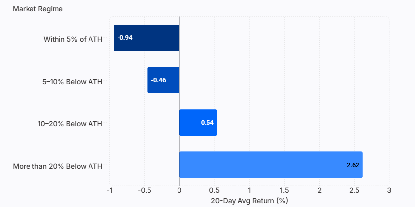
This is one of the more interesting results. Large falls deep in bear markets have historically had stronger rebound characteristics. Large falls near all-time highs have not produced the same rebound profile.
The latest event occurred with the index only around 3.0% below its all-time high. That places it in the “within 5% of all-time high” group, where the 20-day average outcome was negative, even though the median remained positive.
This is a useful distinction. A sell off after a long decline can be due to exhaustion. A sell off near the highs may be an early distribution warning.
History Repeats
The chart below should not be a surprise to anyone who has taken the time to study market history. If it is a surprise, you probably need to do some reading.

The post-2000 period contains the largest number of events, with 144 observations. This reflects the clustering of large down days during the dot-com bust, the global financial crisis, the COVID crash and subsequent modern volatility shocks.
History Repeats
Context is everything.
The latest decline was approximately -2.64%, which places it in the mildest qualifying bucket: -2.6% to -3.0%. That bucket has historically been associated with stronger-than-average results, with positive outcomes in roughly two-thirds of cases over 5, 10, and 20 trading days.
However, the current market structure matters. The latest event occurred:
- above the 200-day moving average;
- within roughly 3% of the all-time high;
- after a market that had not yet entered a deep drawdown.
Those conditions are less compelling than the headline full-sample statistics. The broad historical result says that large down days often lead to a mild positive forward bias. The conditional result says that large down days near market highs are more ambiguous and have not historically produced the same strong rebound tendency as large down days deep in bear markets.
What Now?
Retracements within markets are not automatically bearish, nor are they isolated events that are instant harbingers of impending doom. The historical data does support the idea that the market will hit a new low. My perception is that this is to be expected, particularly when you have a generation of traders who have been reared on markets never going down. And certainly never going down so abruptly. Such an event is bound to cause a dislocation in their psyche and, on a practical note, is bound to have caught a legion of overleveraged traders exposed to margin calls.
Perhaps the most rational interpretation is that the best interpretation is that a -2.6% fall is a volatility marker. It tells us that the market has entered a more unstable state. The forward return distribution widens, emotional narratives grow louder, and both rebound and continuation risks increase.
This sort of market is one that favours patience rather than prediction.