CANDLESTICK CHARTS – YOUR ULTIMATE ANALYSIS TOOL
In many ways, shares behave in a similar way to children. Each child has its own personality from birth. Some are obstreperous and incredibly difficult to look after. Others are placid and calm, never causing a moment of grief. If you can get to know the child, then looking after him or her suddenly becomes much simpler. Likewise, if you begin to understand the share’s price action characteristics, you will learn how to treat it. The particular idiosyncrasies of that share will suddenly seem within the realms of normal behaviour. Technical analysis provides us with tools to assist us in realising this goal.
If this is the first time that you have come into contact with technical analysis, you will want to read this article a couple of times to consolidate the principles. Remember your first day on your job? It was terrifying, wasn’t it? You didn’t know where the lunch room was located, or what was expected of you. Yet, over time, you adjusted and your work became second nature. Trading is exactly the same. Initially, it will seem confusing and strange, but with a bit of effort, you will finally work it out. Be patient with yourself. All it takes is a bit of elbow grease and persistence and you’ll be well on your way to being profitable.
If you are already a skilled trader, then you will find that the following section will act as a form of revision. In any endeavour, the people who excel are those who conquer the basics. When playing cricket, there are actually very few skills that you need to have; for example, catching, batting, bowling and running. Yet it is the application of these basic skills that will separate the cricket professional from the backyard superstar.
Bars, Lines And Candles
As technical analysts, it is our goal to form a view regarding whether a particular share is going up, going down, or moving in a sideways band. Even though there are only three directions in which a share can move, it is sometimes a tricky task to see exactly what a share is doing. Simplicity is essential. When first looking at a chart, get to the grass roots level and have a good look at a share’s price action. You can use a bar chart, a line chart or a candlestick chart.
The markets are made up of people’s emotions towards shares. If they predominantly feel fear that they will lose their capital or profits, then the share price will ultimately decrease. If the participants mainly feel greed or hope, the share price will go up. A chart will show this interplay of emotion in a graphic format.
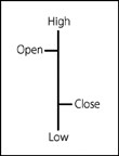
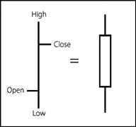
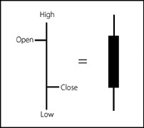
A single Western bar
The individual building block of a bar chart is a single bar. Drawing a single bar requires an opening price, a high, a low and a closing price.The vertical line shows the high and low of that period. The two horizontal lines depict the open and the close. The open is the horizontal line on the left of the vertical line, and the close is the horizontal line on the right of the vertical line. On a daily chart, one bar will show the share price action for one day. If you look at a weekly chart, the open price will be the opening price at the start of the week and the closing price will be the final price recorded at the end of the week. The high and low will be the overall high for the week and the overall low for the week. Whichever time period you utilise, the bar can show the activity for that session.
When many of these single period bars are plotted on a chart, with the horizontal axis representing time and the vertical axis showing the share price, a traditional bar chart is created.
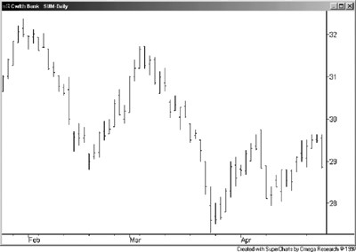
CBA daily bar chart
The interrelationships of the bars show whether the share is generally going up in value (that is, bullish) or going down in value (that is, bearish). Periods of sideways progression are also evident. Indicators may help assist you to understand whether the predominant direction is likely to continue.
A line chart connects the closing prices for each period, and so provides even less information, but is perhaps a simpler chart to interpret in comparison to the bar chart.
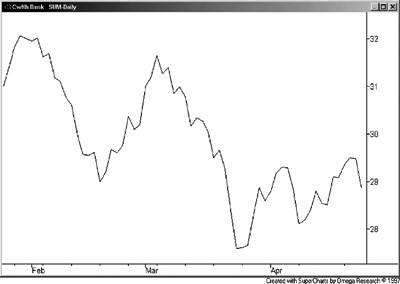
CBA daily line chart
This type of chart is generally used in newspapers when a journalist depicts share price action.
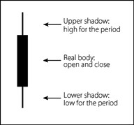
A single candlestick represents the same data that you will find in a single bar, however, the two look completely different. The origin of the name is obvious when looking at the chart. A candlestick chart looks like a series of candles with tails at either end of the candle. Every part of the candle has specific implications.
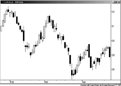
daily candlestick chart
The these three charts in all represent the same information, and the same time scale, yet their graphical format ensures that each chart looks very different.
Why Use Candles Instead Of Bars?
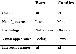
There is a silent war going on between two distinct groups of technical analysts—bar chartists and candlestick chartists. Which is the best type of chart to use for your needs? Let’s rate them according to the following dimensions.
Colour
Bar charts usually show up in boring black. This is hardly adventurous, is it? Such an unimaginative monochrome! Red and green (or black and white) are much more exciting to look at than a boring one-colour depiction of share price action. The colours of the candles instantly epitomise bullish or bearish intent and will let you see at a glance whether the trend is moving up or down, even from the back of an auditorium. This clarity is essential during periods of trading pressure. Candles clearly win on the ‘colour’ dimension.
Number of patterns
An advantage of the candlestick chart is the variety of reversal and continuation patterns these charts reveal. The majority of these patterns are unique to candlestick charting and are not available by using any other method. Whilst bar charts do provide some recognisable patterns, using candlesticks will provide a greater number of triggers into positions, and, if you are using them to exit, they provide many more indications of trend completion. Again, in this category, candlesticks clearly outperform the bar chart.
If you develop an understanding of the psychological principles which drive the creation of a candlestick, you will be more likely to understand its potential impact.
Psychology
If you develop an understanding of the psychological principles which drive the creation of a candlestick, you will be more likely to understand its potential impact. This skill can be applied to any new candlestick pattern that you may come across in the future. The psychology of the candle is simpler to conceptualise and see because of the immediately apparent size of the real body and the colour of the candlesticks. Bars just aren’t as easy to read.
Visual appearance
The visual display of a candlestick chart provides a valuable method of analysing price information. As you attune your eye to candlestick patterns, signals will practically jump off the chart and wrestle you to the ground. All of the information in a standard bar chart is already included in a candle chart; it is just represented in a different format.
Interesting names
Would you prefer to talk about an ‘outside day’ (a bar chart pattern) or ‘a bullish engulfing pattern above an open window’? Candles have cool names that make them an interesting alternative to the mostly anonymous bar pattern. The specific names of a candlestick pattern will help you speak with clarity to other traders familiar with these charts. The names of the patterns are steeped in Japanese history and will quite likely increase your IQ a few percentage points, just by uttering them!
So, all in all, the candlestick is clearly the chart of choice for today’s technical analyst! (You weren’t expecting a different conclusion from the girl who wrote The Secret of Candlestick Charting, were you?)
A quick comparison of charts
In my view, using a candlestick chart is clearly superior to using a bar chart or a line chart. It may take a bit of effort to learn how to interpret these types of charts, but it will give you an edge over other traders in the market. Initially, these charts may look as if they were created by Salvador Dali while he was inebriated, but I promise you that, over time, the fog of confusion will lift. For a complete description of how to use candlesticks to formulate strategies and profit in the Australian sharemarket, refer to my book The Secret of Candlestick Charting and complete my Candlestick Charting Home Study Course or watch The Secret of Candlestick Charting video program available on DVD through www.tradingsecrets.com.au. Let’s have a closer look at these little beauties and learn how to use them effectively.
How To Read Candlestick Charts
The thick part of the candle is called the ‘real body’. This shows the range between the opening and the closing price. When the real body is white (or empty), it means that the close was higher than the opening price. When the real body is black (or filled in), the close was lower than the opening price. As you can imagine, if a share price is driven up for the day, this is a bullish sign, and results in the creation of a white candle. A share price that decreases during the day is a sign that the bears have been in control, which results in the creation of a black candle.
The thin lines above and below the real body are called the ‘wicks’, ‘tails’ or the ‘shadows’ of the candle (regardless of which side of the real body they are located). The upper tail (the high for the day on a daily chart) is located above the candlestick’s real body, and the lower tail (the low for the day on a daily chart) is located below the real body. The tails are usually seen to be of less importance than the real body, as they represent extraneous price fluctuations. The open and the close are considered to be the most emotionally charged points of the day and therefore contain the highest level of significance in candlestick analysis.
Definition of a candlestick
There is a saying that ‘the amateurs open the market and the professionals close the market’. The amateurs have had all night to absorb the rumours and news items about certain shares, and their anxious flurry of activity on the opening of the market reflects this. In the first hour of trading, there is a scramble of punters trying to establish their positions. Once the early morning activity calms down, the market settles into a less volatile period during the middle of the day.
The final hour of the financial markets also experiences a definite increase in volatility as buyers and sellers review the price action that occurred during the day. They must quickly assess whether they can live with their trading decisions overnight, so they must be decisive and brave to buy or sell at the final hour. Emotions again run high as traders buy and sell their shares in accordance with their view of the direction of the market for the following day.
The white candle
As I mentioned earlier, the colour of the candle depicts whether it is bearish or bullish. When the day closes higher than it opened, this is a positive bullish sign. There is demand for the share and buyers are willing to pay higher and higher prices. The price is driven up as demand outstrips supply.
The black candle
 When the day closes lower than its opening price, it is a sign that sellers have fear in their hearts. This has the effect of driving the share price down. The market sentiment is pessimistic, creating a far greater supply of shares. Therefore, the close is lower than the opening price, and the colour of the candle is black. A black candle clearly shows that the bears were in control for that period.
The bulls’ and the bears’ (buyers’ and sellers’) struggle for dominance forms the basis for each candlestick pattern formation. A single candlestick, or a group of candles, often has particular bullish or bearish significance.
Some common candlestick patterns
The shooting star
 This pattern displays an upper tail length that is two times the length of the real body. When a gap (or a hole in the share price action) is present between the previous candle and the shooting star,
the formation becomes more significant. This principle applies to all candlestick patterns. This pattern, as with all top reversal candlestick formations, has greater significance if it is black. Shooting stars appear at the top of a trend and signify that the bears are likely to move in with strength and that a downtrend could occur.
The small bars before and after the candlestick formation will show you the direction of the preceding and following prices on the chart. They have no other special significance in these examples.
The doji
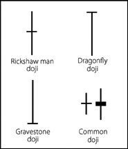 The doji displays an extremely small real body. The open and close are at the same price (or nearly at the same price) for that period. A doji is representative of the market temporarily coming to an agreement about the fair value of the share. The reason for the awesome strength of the doji is the psychological importance of its message. A doji suggests a balance of supply and demand, whereas trends require imbalance. Either the bulls or the bears must actively drive the market for a trend to endure. The doji signifies the end of one trend and the beginning of another. The share will typically reverse its direction the day after a doji appears in the chart of an uptrending or downtrending stock.
The spinning top
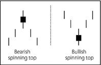 Spinning tops are similar to a doji pattern, as they both display a small real body. The real body in a spinning top formation depicts a greater range from the open to the close in comparison to a doji pattern. The tail length is largely unimportant and the candle can be either white or black. This pattern represents a tug of war between bulls and bears and is accentuated by the presence of a gap before and after its formation.
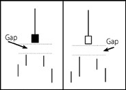
Hammers and the hanging man
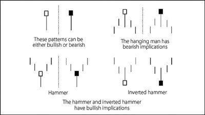
These patterns display a long tail above or below their real bodies. There is likely to be no tail, or a very short tail, on the other side of the real body. The tail length is required to be two times the length of the real body to fulfil the exact definition of this candle. Gaps increase the significance of the pattern. Look for these patterns at the top or bottom of trends to signify that a reversal is likely.
The bearish engulfing pattern
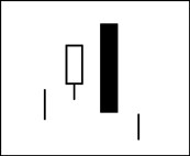 This two-candle combination is an extremely effective pattern that often signifies the dramatic end of an uptrend. After the appearance of this pattern, prices typically plunge downwards steeply. The second real body of this pattern totally engulfs the first real body and is a bearish sign, as the price has closed lower than it opened for that period. The first candle must be white, and the second candle must be black.
The bullish engulfing pattern
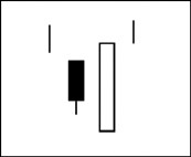 This candle pattern often signifies the end of a downtrend. After the pattern has been formed, prices often surge upwards. The colour of the first candle must be black, while the second candle must be white. If the second candle is accompanied by high relative volume, this is a particularly bullish sign. As with any bottom reversal pattern, the presence of heavy relative volume as the share trends upwards will help confirm the effectiveness of the candlestick.
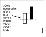
Dark cloud cover
This two-candle formation is a top reversal pattern. The second black candle must penetrate 50 per cent or more into the white candle’s body. In candlestick philosophy, the more significant patterns display greater penetration of one candle into the body of another; therefore, this pattern is not as significant as the bearish engulfing pattern. Confidence is essential to ensure the continuation of an uptrend. The dark cloud cover suggests a loss of confidence by the bulls, and this may lead to a future downturn in trend.
The piercing pattern
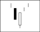
This two-candle bottom reversal pattern is the inverse of a dark cloud cover. The 50 per cent penetration level of the second candle into the body of the first is essential to fulfill the definition of this pattern.
The evening star
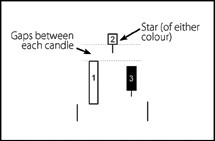
This bearish three-candle top reversal pattern shows a long white real body (1), a small star of either colour (2), then a black real body (3). The evening star pattern is especially significant if there are gaps between each candle.
The morning star
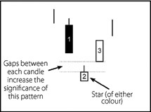
This bullish three-candle bottom reversal pattern shows a long black real body (1), a small star of either colour (2), then a white real body (3). If a bottom reversal pattern occurs within an existing medium-term uptrend, often the effect will be very bullish. However, a bottom reversal during a medium-term downtrend will not show such a vigorous bullish response.
How To Use Candlesticks
There are many other candlestick patterns that appear in Australian charts. Rather than memorising every definition, it is more important to internalise the meaning behind each pattern. The specifics of the formation of candlestick patterns may initially seem a little confusing.
To help simplify the use of candlesticks, try focusing on the following aspects:
- Candle colour: look at the chart, and see whether there are more white candles or more black candles. If there are more white candles, it is probable that the predominant emotion in the market is bullish. If there are more black candles, the bears are more likely to be in control of the bulls.
- Candle length: observe the length of the candles. Look at the real body length, as well as the length of the tails. If there are longer white candles, compared to black, then the bulls are in control. If the black candles are longer than the white, the bears are winning the battle. Roughly equal numbers of black and white candles means that the share is likely to be travelling in a sideways band, and neither the bulls nor the bears are dominating.
- Tail location: if there are lots of tails sticking upwards, this indicates selling pressure, and the share is likely to fall in value. If there are many tails pointing downwards, then the buyers are moving into the market and the share is likely to increase in value.
Your Next Step


Now that you’ve started to become curious about using Candlesticks, you really mus t pursue your own education in this area.
Ideally, you’ll read my book called The Secret of Candlestick Charting. Then you’ll move onto my DVD product called The Secret of Candlestick Charting – DVD and be ready for my The Candlestick Charting Home Study Course. If you have an intermediate understanding of candlesticks patterns and technical analysis, the DVD and Home Study Course will take you a step further in developing your analytical skills and reveal hidden pockets of profit in the sharemarket that other trader’s just step over. The skills will be yours to keep for a lifetime.
For the real enthusiast, I recommend my The ‘Candlestick Lovers’ Pack. Taking you from basic to advanced candlestick concepts, you will become skilled in this amazing charting method. You will also learn some completely new candlestick patterns, macro pattern analysis and the two main patterns that I use to trade.This is the most candlesticky, Candlestick pack I’ve ever produced and you’ll get all of the above products, plus more.
I also have two candlestick-based special reports that you’ll love. The Special Report—Candlestick Pattern Summary is an inexpensive, handy, quick reference guide that you can refer to help you remember the patterns, and confirm the validity of any pattern that you come across. The Special Report—New Candlestick Patterns will introduce you to some brand new, unique candlestick patterns that I have observed from my years trading the Australian markets.
The Mentor Program
As you probably know, I run a 6-month, repeat for free Mentor Program in conjunction with my business partner – Chris Tate. You’ll love the Mentor Program. Chris and I will give you our personal secrets and tricks to help you can develop a fabulous lifestyle where you call the shots.
Many of our traders have told us that there is more information jam-packed into the whole Mentor Program than in a full university degree, all packaged into bite-sized, easy to understand chunks. You’ll develop the skills to make money regardless of the market direction, in whatever conditions get thrown at you.
The Program will take you far beyond anything we’ve ever released through our books and even our advanced home study courses. Candlesticks are a major focus, but you’ll learn the most advanced, cutting edge strategies about how to combine their use in with other technical analysis tools. Whether you’re beginning your trading career, or if you want to boost your results, this Program has been designed for you. Beginners, as well as full-time traders have joined the ranks of our Mentorees, and all have improved their skills.
To get involved, you need to register for Priority Notification. Click here to hear more about it, as well as a bunch of free resources I’ll give you as soon as you register.